I had a great intro to this blog planned, I promise you it might have been close to literary genius but I got distracted editing photos (there was a point to that) and well now you have this intro which is a tribute to probably the greatest intro of all times….
So being more creative – I know I have discussed this both here and on twitter before, both my desire to be more so and the benefits of being more creative as an outlet. For some time now I have been getting back into photography but with limited funds I have been relying on the camera on my phone which don’t get me wrong is a good little camera but the photos have been somewhat dull. Not in topic, I think I have an eye for the right image, but nothing is the colour, depth or vibrancy that real life offers. The answer editing and recommended was the phone app snapseed.
This is a nifty app with a lot of different elements that can be touched up and played with to bring contracts, shadows and warmth back to images that look washed out, dull or grey. Now because I do not really know what I am doing I can’t give you a technical analysis of what I have done but I have played, changed and brought life back to the photos… But I’ll share them and leave it to you to decide.
When it comes to nature shots I like subjects that look magical, other worldly like a bleak lightening like tree or fire in the sky. Mostly what I take never has the depth that I want to capture hence the editing. Partly I am writing this because I like the images but rather than just share them on twitter I also want to keep a record of what editing I have done – that way in time I hope to learn when is it time to add shadow, or when is it time to remove highlights, add warmth, take it away. In time, I might learn what I am doing and in time maybe start presenting better photos.
Below I will share the original image and the final edited one and notes on what effects were used and my thoughts on why I used those effects and why I thought they would work. Feel free to give me your thoughts, recommendations – this is all part of the learning.
Image 1: Beach Scene in Norfolk
I initially used the brush function to change the saturation set on 10, in the lower part of the image and Exposure set on 0.7 to add light to the sky and the top part of the sand, then tuned the whole image in the following way: Saturation +23 Warmth +11
Suddenly we have a sun-drenched beach scene with golden sands, it isn’t as dark or as cold looking. I wanted to make the sand look less dirty and sharpen up the colours in the background.
Image 2: Spider web
This time I just used the tune image function in the following way Contrast +73, Highlights -62 Saturation +61. I love this image but I wanted to dew drops to be more prominent and I wanted the colour contrasts to be more vivid. I am not totally convinced the droplets are as crystal clear as I wanted but maybe that is as much due to the original photo as my editing!
Image 3: Lightening Tree
I call this image lightning tree because some said to me they though it looked like forked lightning, I wanted to bring out the contrast in the image to play with the light and darkness and the shadow. Firstly, because the image is quite dark (it was a very grey raining day I took it on) I used the brush function to lighten the whole image with Exposure set to 0.7. Then used tune image in the following way Contrast +78, Shadow +94 and Saturation +34. I like how the forked lightning branches still look like lightening but I think adding more colour and saturation to the image has given it some life. The colours and tones in the bark have really come out now and there is something more magical about the tree.
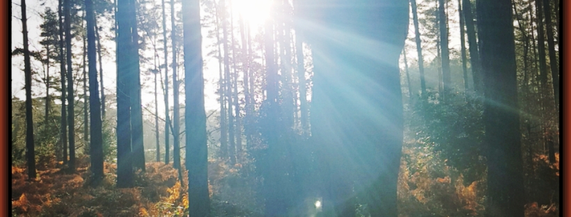
Image 4: Sunlight through the trees
This image I was never able to photograph in the intensity I originally saw it, I think now with the editing it is more than it ever was in real life. With this image to bring out the bright light and to add the shadows and contrast back in, so the image captured the light playing through the trees I used tune to do the following Brightness +72, Contrast +92, Highlights +45 and Shadow – 43. It wasn’t a matter of just making the sun beams more vivid but also the sunlight and shadows at the bottom of the image more prominent and making each tree more defined.
Image 5: Sky on fire
The day I took this the early sun breaking through the clouds looked like fire rolling across the sky, like something foreboding and apocalyptic. It was quite disheartening not to be able to capture it. To add the fire back in to the sky I used tune to add warmth +26 and saturation + 38 but also to add the contrast to it I wanted to also darken the image so I used brightness – 40 so the trees in the for ground were darker against the blazing sky.
These are all first attempts and I will continue to play and learn and hopefully document, but in the meantime advice is always appreciated.
Now having been doubly creative by editing and writing about it I am going to use the rest of my weekend wisely and watch Critical Role, but remember find some time to make something, write something or art something.
As I side note I will add that as the editing and anaylsis of the images were done through my phone I will aplogies if you see them differently, graphics cards are a tricky thing and even loading these images onto my PC has made them look slightly different to how my phone shows them.